
 Will Jones
At first, Loveorbitolight reads as a word. Then its structure begins to interfere with the reading.
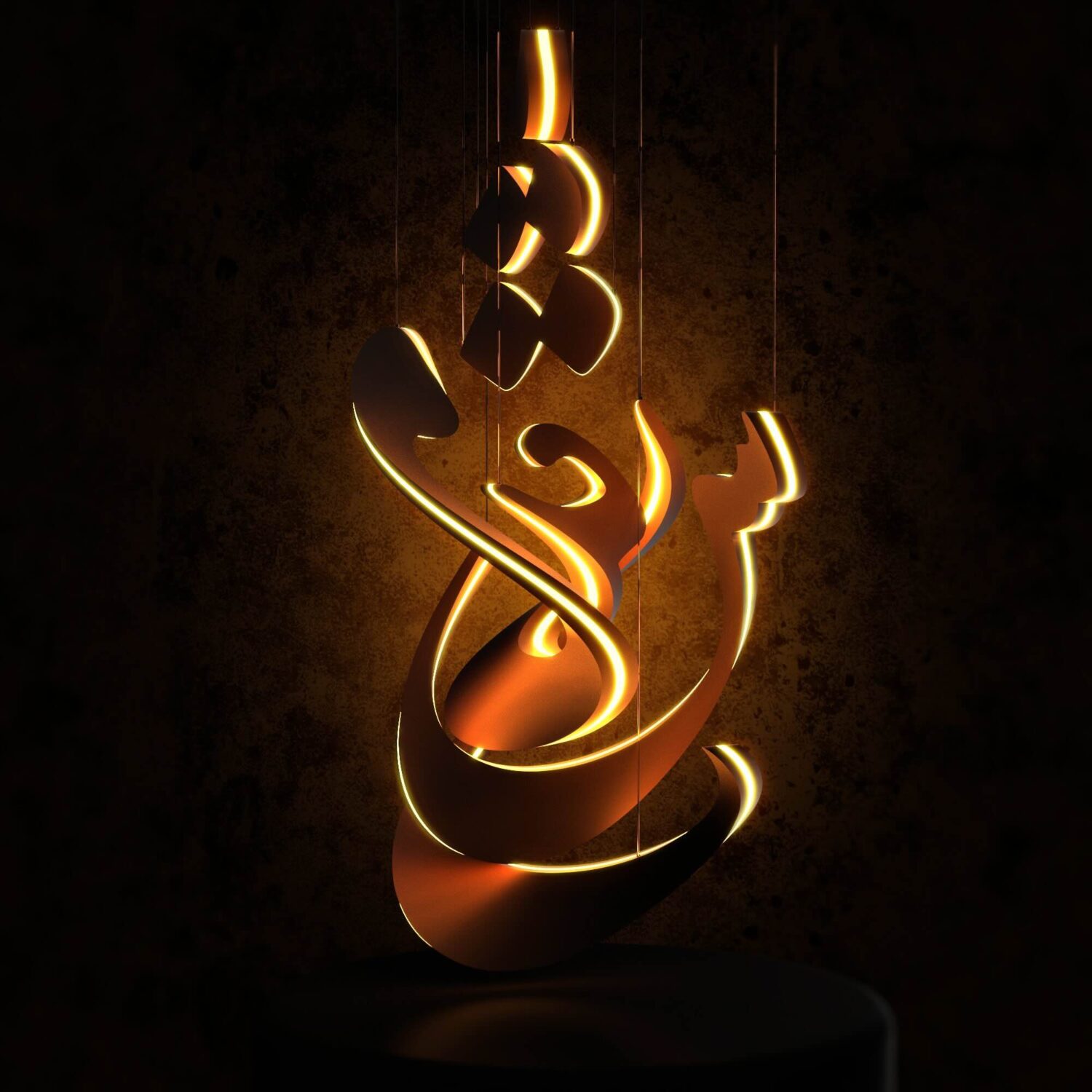
In the project images, the Persian word “Eshgh”—love—remains recognizable, but it no longer behaves like writing on a page. The letters are arranged as thick, suspended forms. Curves overlap, illuminated edges cut through darker surfaces, and gaps open between one stroke and the next. What begins as language becomes a volumetric composition.
Loveorbitolight is one of two entries by Iranian artist Hamid Taherypour recognized by the 2026 D’Light Lighting Design Award in the UAE. Residual Sun received Gold and Loveorbitolight received Bronze, both in the Art and Installation Light category. That result is news, but it is not a verdict on the work.
The D’Light jury included Roger Narboni, Craig A. Bernecker, Derek Porter, Martin Klaasen, Nicholas Bewick, Claudia Paz and Yah Li Toh. Other results included projects involving Cologne Cathedral, the Temple of Hatshepsut in Egypt and James Tapscott’s Arc ZERO: Eclipse. These names place Taherypour’s entries within an international lighting field. They do not remove the need to look closely at what the projects propose.
Residual Sun is the more technical of the two. It brings coloured resin panels, daylight measurement and fading violet illumination in an abandoned greenhouse. Weather is not treated as something to overcome. It alters the anticipated experience: a bright afternoon would leave a stronger trace after dusk, while an overcast day would produce less.
Loveorbitolight is less dependent on systems. Its argument is carried by a word, a silhouette and the emotional familiarity of warm light.
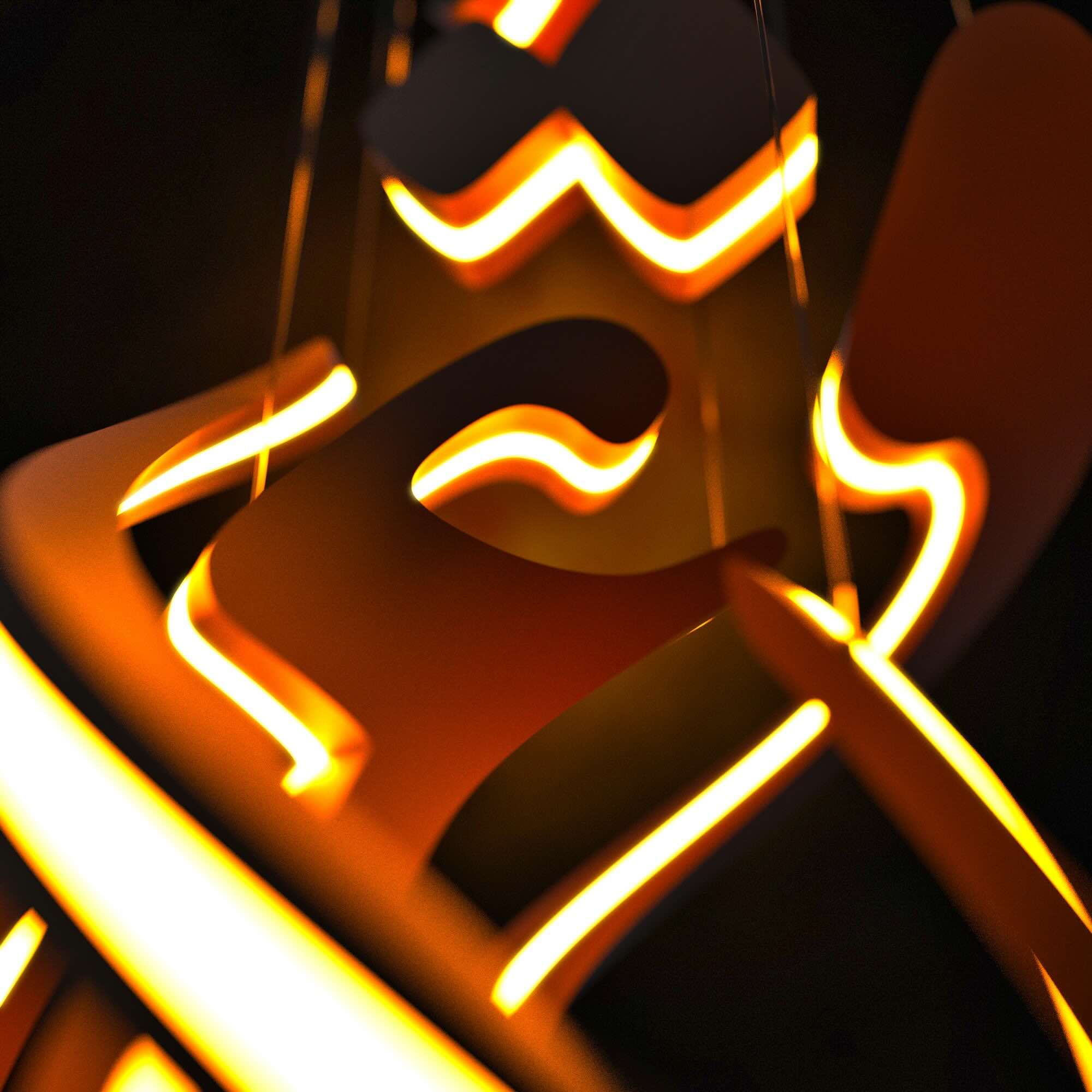
Calling the work sculptural matters. This is not simply a calligraphic sign with LEDs drawn around it. The letters are translated into curved planes with thickness, overlap and apparent weight. Some elements push forward while others retreat. The empty areas between them are active parts of the composition, preventing the word from becoming a single dense emblem.
The decision to suspend the forms is important. Without a visible base, the darker curves appear heavy but unsupported. Light running along their inner edges counters that weight, making the composition seem to lift in places. The project is most convincing where illumination and mass work against each other rather than when light merely traces the calligraphy.
That said, the central metaphor is not especially new. Love represented through light is immediately understandable, perhaps too immediately. Persian calligraphy and amber illumination both arrive with considerable emotional charge already built in. Combined without restraint, they can produce an object that feels decorative before it feels searching.
The division between the scattered upper forms and the denser lower body is another unresolved point. At a proposed height of 180 centimetres, spacing becomes decisive. Too much distance could make the upper marks appear disconnected; too little could turn the lower curves into a visual knot. The same is true of brightness. If every illuminated edge carries equal intensity, the sculpture risks flattening into a glowing outline. Shadow needs to interrupt the light for the volume to remain believable.
This is where the circumstances surrounding the project enter the reading. Taherypour is an Iranian artist turning toward love during a period marked by war, anxiety and loss. It is tempting to treat that choice as an act of resistance. The work itself, however, does not present an explicit political statement, and it should not be made to carry one simply because of the artist’s nationality.
A quieter interpretation is more persuasive. Artists living through difficult periods do not only experience crisis; they also continue to form attachments, remember private histories and imagine beauty. Choosing love as a subject does not cancel violence. It suggests that violence has not occupied every part of emotional life.
The award gives Loveorbitolight visibility, but visibility should not be confused with resolution. The project still has to sustain its balance between word and object, sentiment and form, brightness and shadow. In the available images, that balance is present but not always settled.
Its strongest idea is also its simplest: love is given volume. It acquires edges, weight and empty space. Rather than remaining a slogan, it becomes something the eye must navigate—a form that can be read, lost and found again in light.